Make an AI Iced Tea Poster That Doesn't Look Like AI Slop
Create a clearer iced tea poster with AI using an overdone example and a modern revision. Includes reusable prompts, a practice brief, and design review tips.
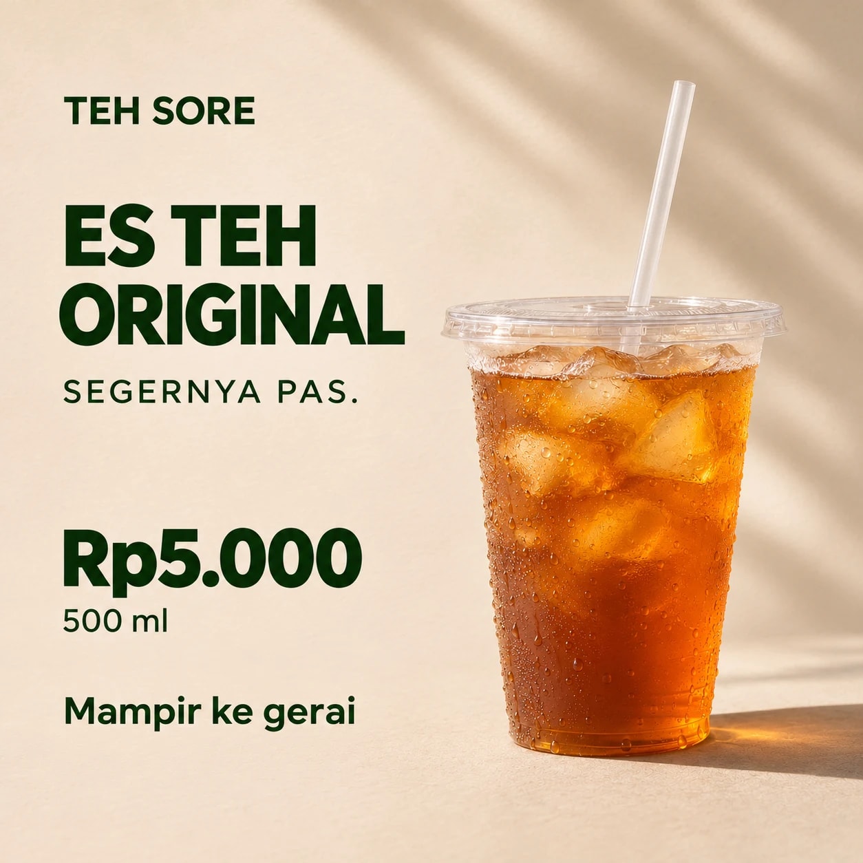
To make an AI promotional poster feel more intentional, start with the offer: what you sell, its price, who buys it, and what they should do after seeing the poster. Then decide the order of information and the image placement. Words such as "cool," "premium," or "viral" don't provide enough direction on their own.
For this tutorial I use Teh Sore, a fictional business selling 500 ml of original iced tea for Rp5,000. I made a deliberately overdone poster and a modern alternative with the same offer. You can download the examples and adapt the prompts to your business.
All product visuals are AI-generated illustrations, not photographs from a real shop. This comparison examines design decisions, not sales performance.
What AI slop means in this example
I use AI slop here to describe a result that piles on effects without enough attention to the message, product, or audience. It is a judgment about this example, not a reliable way to identify AI-generated images.
A busy design can suit a particular brand. A minimalist design can fail if its price is difficult to read or important information is missing. The useful question is: can someone easily understand what you sell?
Adobe's visual communication guide discusses purpose, hierarchy, and consistency. I use those principles to assess the examples below.
The practice brief: sell iced tea
Both posters keep the same information:
| Item | Content |
|---|---|
| Fictional business | Teh Sore |
| Product | Original iced tea |
| Serving size | 500 ml |
| Price | Rp5,000 |
| Supporting line | Segernya pas. |
| Call to action | Mampir ke gerai |
| Practice format | Square social media poster |
The Indonesian supporting line roughly means "just the right refreshment," and the call to action means "stop by the shop." The poster introduces one product and its price. No discounts, health claims, certifications, or testimonials are needed. For a real business, add accurate location or ordering details before publishing.
Example 1: deliberately overdone
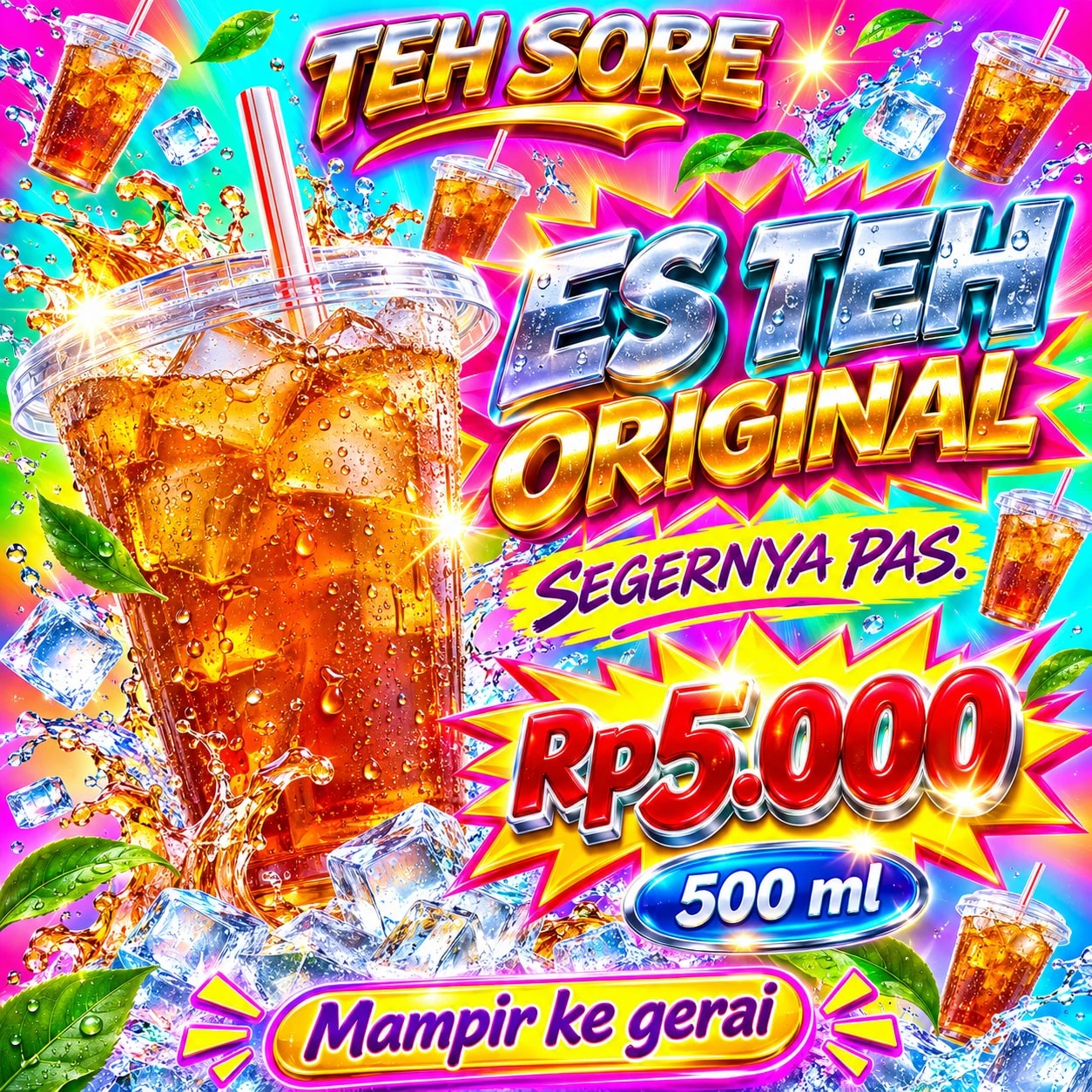
Almost everything wants to be the focal point. The business name shines, the title has metallic effects, the price sits in a colorful explosion, and extra cups appear around the edges. Splashes and decorative leaves fill the remaining space.
The offer is present, but viewers have to sort through many competing elements. The cup and tea also look heavily polished. For this brief, which calls for an approachable neighborhood business, those choices are a poor fit.
Try this simplified comparison prompt:
Make a square poster for fictional business Teh Sore.
The product is 500 ml of original iced tea for Rp5.000.
Write exactly: TEH SORE, ES TEH ORIGINAL, SEGERNYA PAS., Rp5.000,
500 ml, and Mampir ke gerai.

For a design exercise, deliberately make it overdone:
clashing neon colors, glossy 3D lettering, many floating cups,
dramatic splashes, sparkles, and decoration across almost every space.
Make all information compete for attention. Add no claims or offers.
This is a simplified practice prompt, not a promise of an identical result. The full production prompts are also available in the downloads.
Example 2: a modern revision with better text placement
I limited the palette to cream, dark green, and the tea's amber color. One cup becomes the main object. The left column follows an order: business name, product, supporting line, price and serving size, then the call to action.
The first modern version was calmer, but feedback identified weak text placement. I requested a revision: reduce the headline so it doesn't crowd the cup, separate the text and product areas, and improve spacing between information groups. The image above is that revision.
"Modern" alone wasn't a sufficient instruction. Reviewing the result and identifying specific changes still mattered.
| Review point | Overdone example | Revised example |
|---|---|---|
| Image focus | Many cups and effects | One main cup |
| Text hierarchy | Many competing elements | More distinct product, price, and action |
| Color | Many saturated colors together | A more limited palette |
| Space | Almost every area filled | Space between groups |
| Product appearance | Glossy and dramatic | Closer to natural lighting |
These are composition judgments. I haven't tested whether the revision generates more orders.
A reusable prompt for a more intentional poster
Use an image-generation feature in your chosen AI tool. If that feature isn't available, use the prompt to develop a design brief, then build the poster in a design editor.
Make one square poster for fictional business Teh Sore.
Goal: introduce affordable original iced tea.
Audience: people near the shop who want a cold drink.

Write these Indonesian strings exactly:
TEH SORE
ES TEH ORIGINAL
SEGERNYA PAS.
Rp5.000
500 ml
Mampir ke gerai

Visual direction:
- Cream background, dark green text, amber tea as the accent.
- One clear plastic iced tea cup with a flat lid and straw.
- Give text the left area and the product the right area.
- Leave clear space between them; text must not touch the cup.
- ES TEH ORIGINAL may use two lines but must fit in the left area.
- The business name is smaller than the headline.
- Group the price and serving size together.
- Place the call to action below the price group with comfortable spacing.
- Align all text to the same left edge.
- Keep generous outer margins and use at most two typefaces.
- Natural lighting, believable ice and condensation, a grounded shadow.

Add no fruit, extra cups, explosions, 3D text, testimonials, discounts,
health claims, certifications, or information not provided.
This is a fictional product illustration for practice, not a real photo.
For your business, replace the name, product, price, size, audience, and call to action. When supplying a real product photo, add: "Preserve the packaging shape, product color, logo, label, and contents shown in the reference. Don't invent details that aren't visible." Still compare the result with the actual product.
Keep the product authentic: take a phone photo and upload it
For real sales, start with a photograph of the product you actually sell. If your iced tea comes in a short cup with a sealed top and a small sticker, don't let AI replace it with a tall cup and flat lid simply because that looks more attractive. Buyers need an accurate idea of what they will receive.
You can prepare the photo with your phone:
- Make a serving as a customer would receive it, with the actual cup, lid, straw, and label.
- Clean the lens, place the product near a window with soft light, and use a plain background so the cup's edges are clear.
- Take a front view and a slightly angled view. Keep the whole package in frame, the image sharp, and label text readable. Avoid filters that change the tea's color or smooth away details.
- Choose one main photo. Add a detail view if the logo or lid is unclear, using the same product and serving size throughout.
- Upload the photo with the prompt to an editing feature or a tool that accepts image references. Identify the main product photo. If the tool cannot read images, don't rely on instructions to "follow the photo."
A simple background and a phone support can help keep the result consistent. Shopify's product photography guide also discusses product preparation, lighting, and camera stability.
Once the photo is attached, use this prompt together with the business details and poster text above:
I have attached a real product photo that I took with my phone.
Use the first photo as the actual product in the poster, not simply as
inspiration to redraw a similar drink. Additional photos show details only.

Preserve the cup shape and proportions, lid type, straw, drink color,
logo, label, and visible contents from the photo. Add no fruit, toppings,
larger portions, or packaging details absent from the source.
Don't infer serving volume from the photo; use the size stated in my brief.

Put text in the left area and the product in the right area.
You may replace the background and reasonably adjust surrounding lighting.
Don't crop away part of the product or change its identity.
If a detail is unclear or this cannot be done without redrawing the product,
explain that limitation first.
Use only the text, price, and business information I provide.
A reference provides guidance but doesn't guarantee exact product preservation. Compare the output with the phone photo: check cup shape, lid, tea color, logo spelling, and label details. If they change, don't use that output to represent the product you sell.
If packaging or logos keep changing, place the original photograph in Canva or another editor as the product element, then arrange the background and text around it. That keeps the product from your own photograph. Both Teh Sore posters in this article remain AI illustration examples; I did not use a real phone product photo to make them.
Give specific revision instructions
Attach the previous result to a tool that supports image editing or revision, then try:
Keep the business name, price, size, colors, and product from this image.
Change only the composition:
1. Reduce the headline so ORIGINAL fits entirely in the left area.
2. Separate text from the cup so they don't touch.
3. Align the business name, headline, price, and action to one left edge.
4. Put 500 ml closer to the price so they read as one group.
5. Move the call to action away from the bottom edge.
Add no wording, objects, offers, or claims.
AI may still change details you asked it to preserve. Check every line again. If lettering or spacing remains troublesome, generate the product visual without text and add editable text in Canva or another editor.
Review before using it to sell
View the poster at phone size. Check whether the product, price, serving size, and action are readable without zooming. Verify spelling and every zero in the price. Compare the packaging and contents with what buyers will receive.
For a real poster, add accurate location or ordering information. Review any crop for a different format; a square poster won't automatically work as a Story or banner.
Ask someone who hasn't seen the brief to name the product, price, and next action. If their answers differ from your goal, revise that part.
Download the practice materials
- Practice brief and reusable prompts, TXT
- Overdone poster, PNG
- Revised modern poster, PNG
- Original production prompts and revision notes, JSON
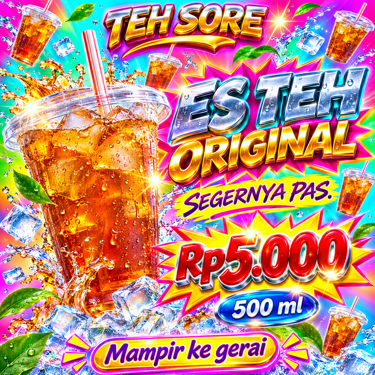
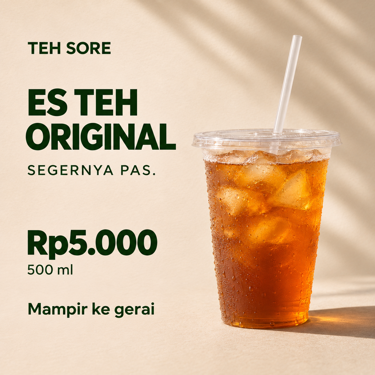
All examples use a fictional business. The production record contains the instructions actually used. The article's prompts are simplified for easier adaptation, and subsequent generations may differ.
Is your team still doing something by hand?
Tell me about it, and let's find the fix together.
More notes
How to Back Up a Website in cPanel Before Updating PHP
Back up website files and databases in cPanel before a PHP update. Understand full and partial backups, off-server copies, and how to plan a website recovery.
Read the note
How to Compare Two Excel Files and Find Changed or Missing Records
Compare two Excel reports by ID to find added, missing, and changed transactions. Includes sample files, practical formulas, and a reconciliation of the totals.
Read the note